Rebranding UpNorth Media Center
The decision to rebrand UpNorth Media Center to Traverse Area Community Media (TACM.tv) came from a desire to clarify our identity and eliminate the brand confusion caused by the many “UpNorth” brands in the region, particularly UpNorth Live. We wanted a name that more clearly described who we are and what we do—“Community Media”—while also highlighting the region we serve, the “Traverse Area.” While the full name is descriptive, we often use the shorter TACM or TACM.tv for simplicity and consistency across platforms.
For the logo, I wanted to create something playful, minimalistic, and modern to reflect our fresh start. The old design had grown outdated, so I drew inspiration from the simple camcorder icon often used in film storyboards. Using negative space, I integrated a hand holding the camcorder, symbolizing active creation and documentation—core elements of community media. This imagery captures the spirit of collaboration, storytelling, and accessibility that defines our mission.

To reinforce our connection to the Grand Traverse region, I chose a medium-toned teal as the primary logo color. This specific teal was sampled directly from the waters of West Grand Traverse Bay on a sunny day, grounding our visual identity in the natural beauty of our community. The broader branding uses greens and blues, reflecting the region’s deep connection to water and lush forests, two essential elements of life in northern Michigan.
The result is a cohesive, meaningful brand that celebrates our role in empowering local voices while honoring the natural richness of the Traverse Area. The rebrand has helped us communicate our purpose more effectively, strengthening our connection to the community we serve.
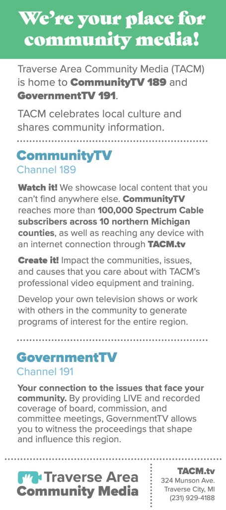
Example Designs with New Branding

